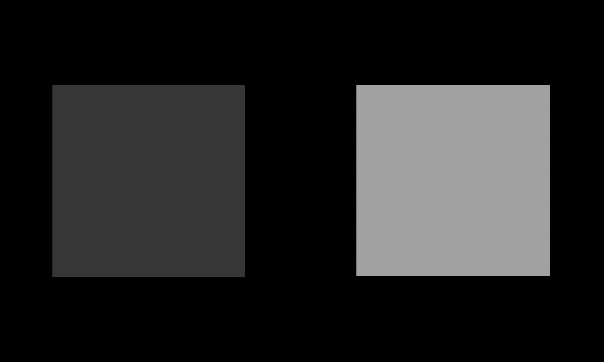
While we know that the dark-is-more bias influences inferences about visualizations, it isn’t clear whether it can apply in other situations. My first project as a graduate student aimed to clarify this. In a series of 4 experiments, I found that the dark-is-more bias affected people’s interpretations of abstract shapes: that is, people expect darker shapes (specifically squares) to mean “more.” I also found that when squares look more opaque, people expect them to mean larger quantities relative to squares that look transparent.
For the pair of squares on the white background (left), we expect people to choose the darker one as more. On the black background (right), we expect people to choose the lighter (more opaque) as more.


The article for this study is in prep, and will likely be published in 2023-24. This work was done in collaboration with Karen Schloss.