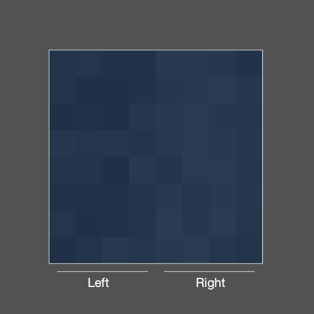
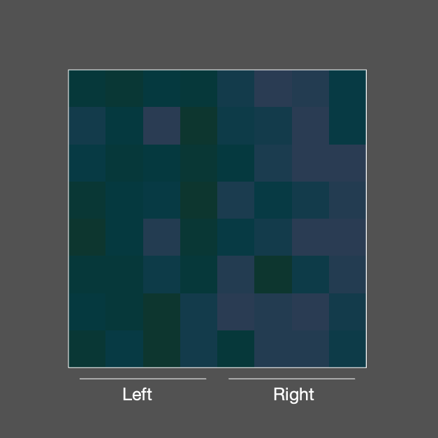
The dark-is-more bias relies on people being able to tell that there are darker and lighter areas in a visualization–i.e., a visualization must vary in lightness. Based on previous research, we also know that people have trouble seeing variation in lightness when there is also variation in hue (to test this, just try to match two different color swatches on their lightness; you’ll likely find it very hard). Because variations in hue make it more difficult to see variations in lightness, it could be that people’s inferences are less influenced by the dark-is-more bias when there are variations in hue.
In 2022, I began a project to test this. I found that, for maps with small lightness differences, people consistently choose the darker side as meaning larger quantities less often when there are also variations in hue. Below are some examples of the maps I used.
The article for this study is in prep, and will likely be published in 2023-24. This work was done in collaboration with Karen Schloss and Danielle Szafir.