Data distribution, or the way data are spread throughout a visualization, can affect people’s interpretations of a visualization. Though people show a dark-is-more bias when making inferences about maps, a very salient, light hotspot can override this dark-is-more bias, leading people to infer that the lighter area (i.e., the hotspot) means larger quantities. However, to date this has been the only study showing effects of data distribution on inferences.
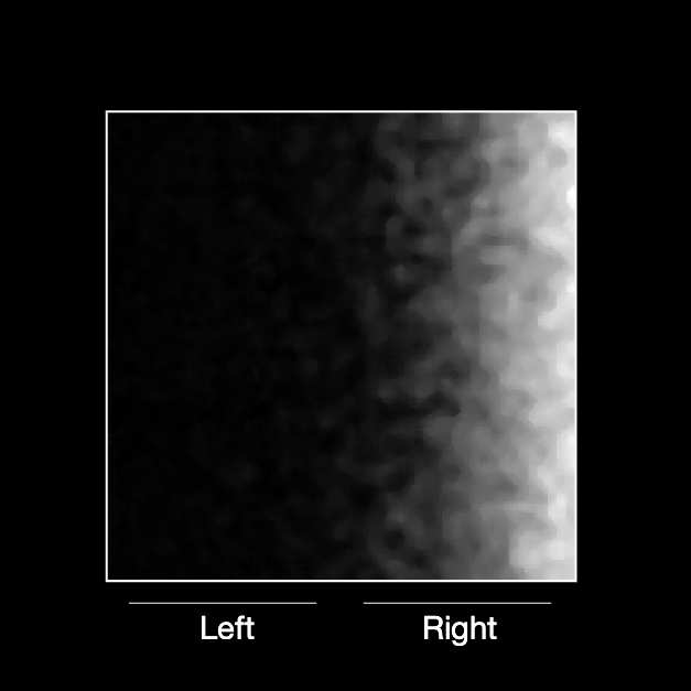
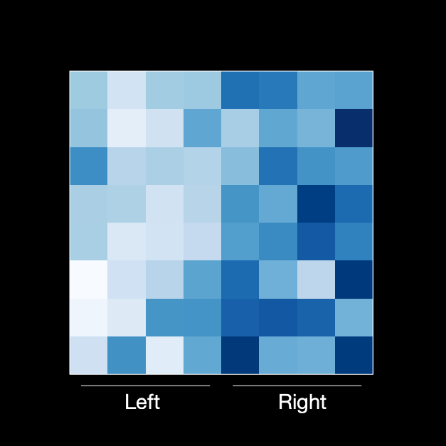
Is it possible for data distribution beyond just hotspots to affect inferences? I tested this question by creating maps where data were spatially organized out in different ways. Below are some examples. I hypothesized that when data appeared to be “squished” to the side (leftmost map), then people would infer that lighter areas meant larger quantities. This would have been because the dark area appeared as a hole, or empty space, that matched the background.
My results were far more complicated than I had predicted. We are still making sense of them, but for now, it is safe to say that the dark-is-more bias is strong, though it is possible to reverse it in some cases.
The article for this study is in prep, and will likely be published in 2023. This work was done in collaboration with Karen Schloss, Chin Tseng, and Danielle Szafir.